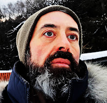
I Want What I See, 30"X40", acrylic on canvas, 2011
 "City Park Trail" takes the viewer into a picture space, reminding of a park trail. This piece is made with the use of broad paint application. Brush, palette knife and paint spills create a vibrant surface that the viewer would want to examine up close. Subdued dark purples, grays, browns, greens and black make up the shadow areas of the piece. Subtle grades of orange-brown, brown-green, gray, ochre and highlights set the mid-tone and the light in the painting. "City Park Trail" is 36" X 24", acrylic, 2009.
 It is a brand new day in the city and you are here, somewhere, with me... I live in Toronto, Canada. My reality unfolds in this modern city where technology and people are intertwined. Influenced by the immediate environment I tend to bring it's elements into my work. The image, the paint and the graffiti become combined in my painting in order to satisfy my search for the visual language reflective of the human condition. "and the city" is romantic, hopeful and poetic.
  "Morning Coffee" is a decorative piece created using an abstract layer of smeared acrylic paint, overlaied with classical realistic painting. A horizontal canvas with black, blue, purple, gray and orange-brown background creates tonal and color contrasts. Paint marks are expressively broad and intertwined, add an impression of movement. Complementary palette continues in the still life of a coffee cup and a plate with croissant painted over the background. "Morning Coffee" is available for purchase on eBay at a great price.
In 2007 I was nominated to receive an Honoris Causa. The recipients of this award are selected by The National Ethnic Media And Press Council of Ontario. Every year one or more people are nominated for the award by every ethnic community media office. The candidates have to have a history of contribution to their community. I was picked by the Russian media due to my close to 8 years involvement in private art education. Newcomers and art students of Russian background often lack the information on how the Canadian fine arts education works. I shared my personal experience via media interviews, documentaries and articles. As a result many enthusiastic students of Russian background enrolled in art programs throughout our province. When I came to Canada in 1992 there weren't many resources on what a competitive fine arts portfolio was or what were the steps to getting an undergraduate or a post graduate degree in art. Canada was a new country with new rules.
 Woods At Sunset, 2009, acrylic on canvas, 30"X30" gallery wrap